


Packaging as a First Impression: What Your Pouch Says Before a Word Is Read
Before a consumer reads a label, scans a QR code, or even registers your brand name, their brain has already judged your product. The texture, color, shape, and design of your packaging have created a first impression — and in today’s crowded marketplaces, that impression must be instant, intentional, and unforgettable.
Pouch packaging is no longer just about containing a product; it’s become a powerful form of non-verbal communication. With trends leaning toward minimalism, sustainability, and sensory engagement, your pouch does more than protect — it speaks. And what it says can directly influence buying behavior.
So, what does your pouch say before a word is even read?
1. Shape and Structure: Silent Signals of Quality
The physical structure of a pouch can influence perceived value. For instance, a stand-up pouch suggests stability and substance. It tells the consumer, "This product is meant to be displayed and appreciated." Compare that to a flat pouch, which might speak to convenience, portability, or minimalism.
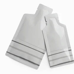
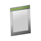
Different product types benefit from different forms. The White Pouch Flat (Cosmetic), for example, often suggests purity, cleanliness, and a focus on high-quality ingredients. Its sleek, modern appearance instantly appeals to consumers who associate white packaging with luxury, science-backed skincare, and natural wellness products.
2. Material Matters: The Feel That Builds Trust
Before a label is ever read, customers often touch the packaging — whether in a retail store or while unboxing at home. The feel of the material sets the tone. Is it matte or glossy? Smooth or textured? Does it crinkle or feel rigid?
Consumers tend to link tactile experience with product value. A smooth, thick pouch can signal premium quality, while flimsy, thin materials may suggest low-end goods, regardless of what’s inside. That’s why many brands are now using layered materials with matte finishes or soft-touch coatings to enhance the sensory experience.
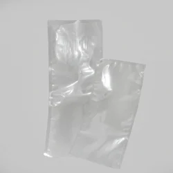
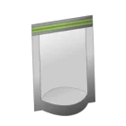
One growing trend is the use of Transparent Pouch Flat (Vacuum Bag) packaging. These vacuum-sealed pouches give off a clinical, high-precision vibe, often associated with freshness, safety, and technical control. It’s a silent way of saying: "This product has been preserved with care and expertise."
3. Visual Clarity: Seeing Is Believing
Transparency in packaging does more than look clean — it conveys honesty. When consumers can see the product, it builds trust before any branding even comes into play. This is especially true in food, supplements, and natural products, where clarity equals confidence.
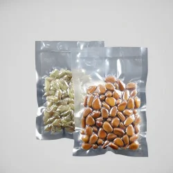
A popular choice for brands tapping into this trust-building effect is the Clear Front, Black Back Pouch Flat. This format offers the best of both worlds: the transparent front lets customers see what they're buying, while the black back gives space for strong, brand-forward design elements. The contrast also enhances shelf appeal, making the product stand out instantly in retail environments.
4. Color Psychology: Speaking Through Shade
Colors subconsciously influence how we feel about products. Pastels are often used for calmness and beauty; bold colors like red and black suggest power and luxury. Green indicates health or sustainability, while gold implies premium pricing.
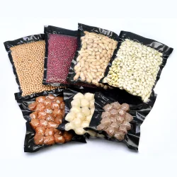
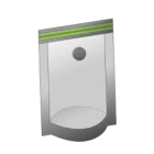
What’s crucial is that color and function work together. Take the Transparent Pouch Flat — commonly used in snack foods, pet treats, and health products. Its simplicity and transparency are visually calming, suggesting the product is fresh, natural, and straightforward. Brands that emphasize “nothing to hide” messaging often lean into this clear design to visually back up their claims.
Meanwhile, minimalist monochromes like pure white or matte black are being used to elevate branding and tell a different story — one of quiet confidence and modernity.
5. Typography and Labeling: The Silent Companion
Even though this article is about the impression a Pouch makes before words are read, typography still plays a subtle role. Clean, minimalist fonts reinforce premium or modern brand values. Handwritten or script fonts suggest warmth, personality, or artisan craftsmanship.
While not the focus at first glance, font size, placement, and even spacing contribute to the initial perception. If the typography is messy or cluttered, it can send negative signals before a word is consciously processed.
Pairing typography with pouch material is essential. Imagine an elegant serif font on a White Pouch Flat (Cosmetic) with a matte finish — the overall impression is likely one of calm, sophisticated luxury.
6. Cultural Context and Trends
What a pouch “says” can also change depending on location and audience. For example, a minimalist pouch may perform well in urban markets where consumers value aesthetics and sustainability, but it might underperform in rural or traditional markets where visual storytelling or product imagery is more critical.
Understanding your market means understanding what kind of “non-verbal language” your pouch is speaking. Is it whispering luxury, shouting convenience, or softly suggesting health and wellness?
Conclusion: Designing First Impressions With Intent
Your pouch doesn’t just protect your product — it presents your brand’s first hello. In a matter of milliseconds, it communicates value, identity, and emotion. Every design choice — from color and material to shape and transparency — plays a part in shaping that moment.
Today, customers expect more than good looks; they expect packaging to reflect the ethos of the brand itself. Whether you're using a Transparent Pouch Flat for organic granola or a Clear Front, Black Back Pouch Flat for premium snacks, the choices you make in pouch design are silent ambassadors for your product.
At Entrepouch.com, we understand that first impressions can make or break a sale. That’s why we offer a wide range of customizable pouch packaging options designed to help your brand speak — even before a word is read.